ARUP Global: The Unifying Power of Iconography
Well designed icons can be a simple yet powerful tool for corporations to establish a clear visual language that creates unity across collateral globally.
ARUP
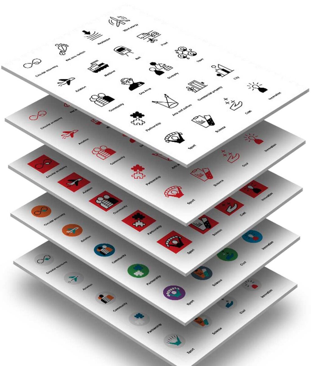
Design and illustration of a suite of 52 icons by Sue Doeksen
Arup’s unified visual language
Imagine five people who speak five different languages, all being able to read the same story without using any words. Icons used together are a visual and universal way to tell a story and can make the world a more navigable, inclusive world.
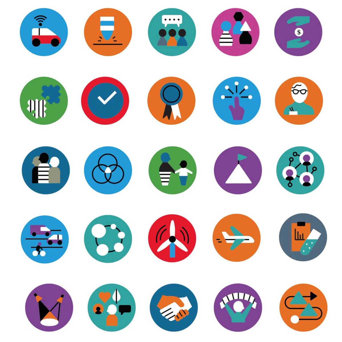
Led by Kath Wallace the Brand, Creative and Content Agency Lead, Australasia, Arup’s Marketing Team collaborated with Swedish illustrator Sue Doeksen to design and illustrate a Global icons Suite. These are for Arup to use in client engagement tools such as bids, reports, presentations and infographics helping clients and colleagues visualise the story and narrative being told. Each icon has been intelligently designed based on many factors briefed in by the Arup team including inclusion, diversity and colour blindness. As well as different colour applications, including red and white, full colour, red background and grey background.
When creating these icons, it was crucial all members of the Arup team could all understand them instantly. Icons effectively communicate to a diverse audience spanning cultural, geographical and language differences, therefore they needed them to be fit for purpose and live up to this narrative.
There is a total of 50 Arup icons, under six different topics, which include: Sustainable Development, Transport, People, Arup’s aims, Industry and Winning Work.